
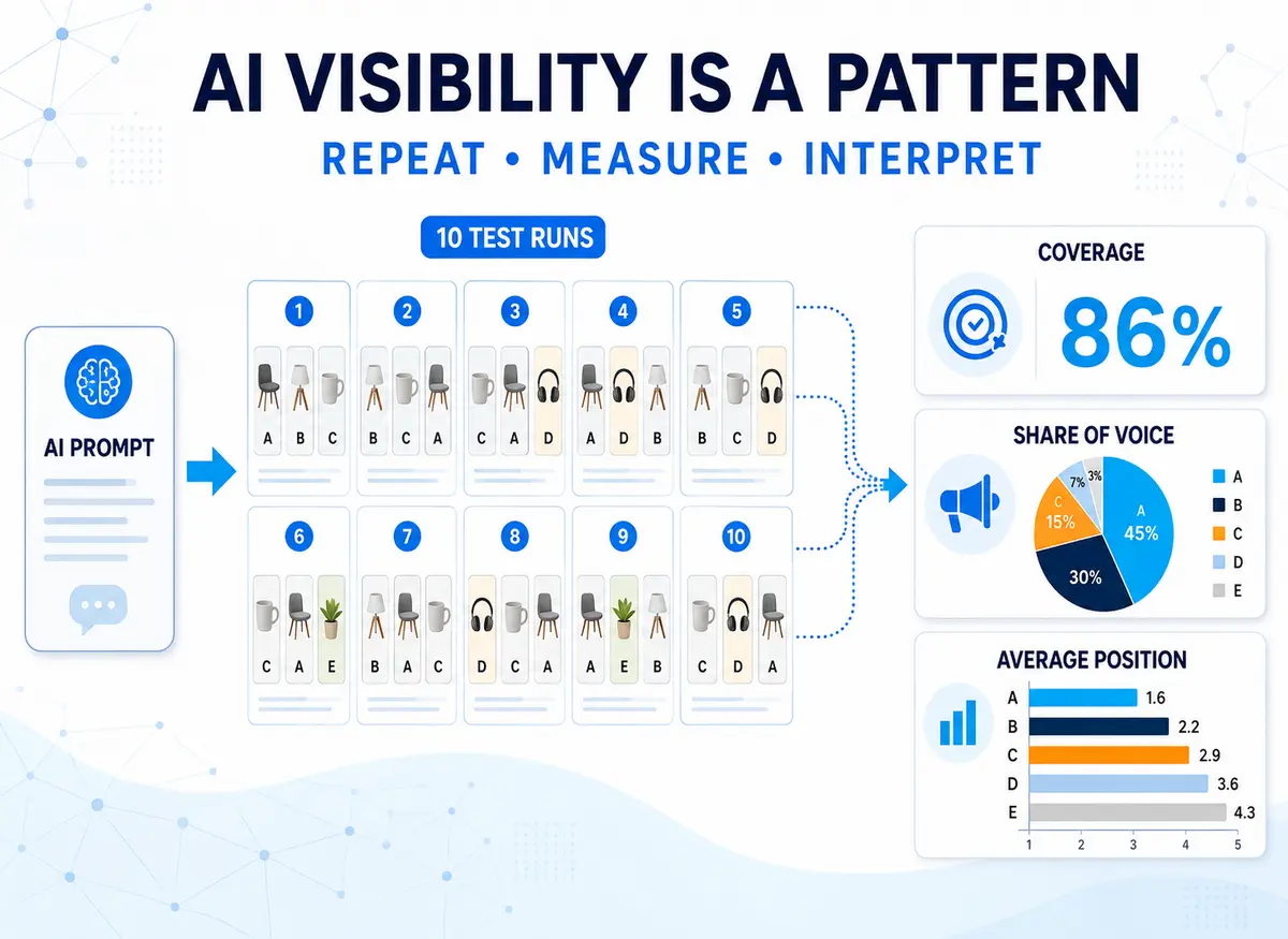
Repeated AI searches can produce a large collection of answers, screenshots and product names. The challenge is turning those observations into measurements that mean something.
In my ten-run Google AI Mode experiment, I submitted exactly the same project-management software query ten times.
Each response contained a three-product shortlist. Across the ten runs:
- 30 recommendation positions were available;
- six different products appeared;
- four products occupied first place;
- only one product appeared every time.
This article uses that genuine dataset to demonstrate four simple manual measurements:
- recommendation coverage;
- share of recommendation positions;
- first-position rate;
- average recommendation position.
These are transparent calculations rather than universal industry-standard definitions. Different monitoring platforms may calculate visibility and share of voice in different ways.
The shift from checking a rank to measuring a pattern
Traditional keyword monitoring was largely based on a positional model.
A webpage might rank third for a particular search. Rankings could change because of location, personalisation, competitors or algorithm updates, but immediately repeating the search would usually produce a recognisably similar results page.
AI-generated answers behave differently.
An AI platform constructs a response using its model, retrieved information and the requirements contained in the prompt. Repeating an identical query can produce a different shortlist, order, explanation and collection of supporting sources.
AI recommendation visibility therefore cannot always be represented by one fixed position.
Instead of asking only:
“Where did the product rank?”
we also need to ask:
“Across repeated responses, how frequently did the product appear and how prominently was it presented?”
The answers in my experiment were dynamic, but not completely random. Teamwork appeared every time, ClickUp appeared in seven responses and certain shortlist combinations recurred.
Repeated testing revealed an underlying pattern that no single response could show.
AI recommendation visibility is better understood as a distribution of appearances than as one permanent rank.
What exactly are we counting?
Before calculating anything, the counting rules must be clear.
For this exercise:
- A product counted only if it appeared in the requested three-option shortlist.
- A citation did not count as a recommendation.
- A product mentioned elsewhere did not count unless it was shortlisted.
- Each product could count only once per response.
- First, second and third positions were recorded as presented.
- “Teamwork” and “Teamwork.com” were treated as the same product.
- Every run contained the same three available recommendation positions.
The calculations therefore measure recommendation visibility, not every possible form of AI visibility.
A business used as a supporting source would not be included unless its product was also placed in the shortlist.
The complete dataset
These were the ten recorded results:
| Run | First | Second | Third |
|---|---|---|---|
| 1 | ClickUp | Teamwork | Xero Projects |
| 2 | Xero Projects | Teamwork | ClickUp |
| 3 | Teamwork | Productive.io | Paymo |
| 4 | Teamwork | ClickUp | Productive.io |
| 5 | Avaza | Teamwork | ClickUp |
| 6 | ClickUp | Teamwork | Xero Projects |
| 7 | Teamwork | Paymo | ClickUp |
| 8 | Xero Projects | Teamwork | Avaza |
| 9 | Teamwork | Productive.io | Paymo |
| 10 | Teamwork | ClickUp | Xero Projects |
Publishing the underlying data allows readers to check the calculations rather than simply accepting a finished score.
1. Recommendation coverage
Recommendation coverage measures the percentage of responses in which a product appeared in the shortlist.
The calculation is:
Recommendation coverage = product appearances ÷ total responses × 100
Teamwork appeared in all ten responses:
10 ÷ 10 × 100 = 100%
ClickUp appeared in seven:
7 ÷ 10 × 100 = 70%
Avaza appeared in two:
2 ÷ 10 × 100 = 20%
Recommendation coverage answers:
How consistently was this product recommended?
It does not consider whether the product appeared first, second or third.
2. Share of recommendation positions
The ten responses contained three recommendations each, creating 30 available positions.
A simple recommendation share-of-voice calculation is:
Share of recommendation positions = product appearances ÷ all recommendation positions × 100
Teamwork occupied ten of the 30 positions:
10 ÷ 30 × 100 = 33.3%
ClickUp occupied seven:
7 ÷ 30 × 100 = 23.3%
Xero Projects occupied five:
5 ÷ 30 × 100 = 16.7%
The percentages for all products add up to 100%. They distribute the available recommendation positions across the competitive group.
Coverage and position share overlap in this experiment
Recommendation coverage and share of recommendation positions may look like two independent confirmations of performance. In this experiment, they are mathematically connected.
Every response contained exactly three recommendations. Therefore:
Position share = recommendation coverage ÷ 3
Teamwork had 100% coverage and a 33.3% position share.
ClickUp had 70% coverage and a 23.3% position share.
The two figures present the same underlying appearances from different perspectives. They do not provide completely independent evidence in this fixed three-product experiment.
This is worth remembering when viewing visibility dashboards. Several displayed metrics may describe closely related aspects of the same underlying data.
Position share becomes more distinct when responses contain different numbers of recommendations or when results from multiple prompts and competitive groups are combined.
The formula must be understood before the score can be interpreted.
3. First-position rate
Recommendation coverage does not tell us how prominently a product appeared.
The first-position rate measures how frequently it occupied the first shortlist position:
First-position rate = first-place appearances ÷ total responses × 100
Teamwork appeared first five times:
5 ÷ 10 × 100 = 50%
ClickUp appeared first twice:
2 ÷ 10 × 100 = 20%
Xero Projects also appeared first twice:
2 ÷ 10 × 100 = 20%
Avaza appeared first once:
1 ÷ 10 × 100 = 10%
Productive.io and Paymo never appeared first.
AI Mode does not necessarily describe its ordered shortlists as formal rankings. However, the first product receives the most prominent placement, so recording it remains useful.
4. Average recommendation position
Average position measures where a product typically appeared when it was included.
The calculation is:
Average position = total of recorded positions ÷ number of appearances
Lower numbers indicate greater prominence.
Teamwork
Teamwork’s positions were:
2, 2, 1, 1, 2, 2, 1, 2, 1, 1
These total 15 across ten appearances:
15 ÷ 10 = 1.50
ClickUp
ClickUp’s seven positions totalled 15:
15 ÷ 7 = 2.14
Xero Projects
Xero Projects’ five positions totalled 11:
11 ÷ 5 = 2.20
Average position should be calculated only from responses in which the product appeared.
However, it must always be read alongside recommendation coverage. A product appearing once in first position would have an excellent average position of 1.00 despite being absent from every other response.
Coverage measures consistency. Average position measures prominence when present.
Complete results
| Product | Coverage | Position share | First-position rate | Average position |
|---|---|---|---|---|
| Teamwork | 100% | 33.3% | 50% | 1.50 |
| ClickUp | 70% | 23.3% | 20% | 2.14 |
| Xero Projects | 50% | 16.7% | 20% | 2.20 |
| Productive.io | 30% | 10.0% | 0% | 2.33 |
| Paymo | 30% | 10.0% | 0% | 2.67 |
| Avaza | 20% | 6.7% | 10% | 2.00 |
No single column provides the complete picture.
How one response could have been misleading
Run 5 returned:
- Avaza
- Teamwork
- ClickUp
If Avaza had checked only that response, it could have concluded that it held the strongest visibility for the query.
Across the complete experiment:
- Avaza appeared in two of ten responses;
- its recommendation coverage was 20%;
- it occupied 6.7% of the available positions;
- it ranked first once;
- its average position when present was 2.00.
The first-place appearance was genuine. It simply did not represent Avaza’s wider pattern across the ten runs.
Productive provides a useful contrast. It appeared more frequently than Avaza, with 30% coverage, but never ranked first.
Which performed better depends on what is being measured:
- Productive had greater consistency.
- Avaza achieved the more prominent individual result.
That is why one unexplained visibility score can conceal important differences.
A simple worksheet structure
A manual spreadsheet only needs two sections.
Testing setup
| Field | Entry |
|---|---|
| Prompt ID | |
| Exact prompt | |
| AI platform | |
| Testing date | |
| Personalisation setting | |
| Number of runs | |
| Recommendations requested per run |
Results
| Run | First | Second | Third |
|---|---|---|---|
| 1 | |||
| 2 | |||
| 3 | |||
| 4 | |||
| 5 |
Add more rows for additional runs.
For each product, count:
- total appearances;
- first-place appearances;
- total of its recorded positions.
Those figures are sufficient to calculate all four measurements used in this article.
These figures describe the sample, not the future
Teamwork’s 100% recommendation coverage means it appeared in all ten collected responses.
It does not prove that Teamwork will appear in every future response, for every user or on every AI platform.
Similarly, Avaza’s 20% coverage does not establish a permanent one-in-five probability.
The results describe:
- one prompt;
- ten responses;
- one AI platform;
- one account and location;
- one testing period.
The web and AI platforms also change over time. New products launch, webpages are updated, prices change, models develop and retrieval systems are adjusted.
Repeating the same controlled test later would show whether the observed distribution remained similar or had shifted.
Immediate variation is not necessarily a trend
Suppose monitoring software runs a prompt on Monday and a product appears first. It runs the prompt again on Tuesday and the product disappears.
That does not automatically prove that the product suffered a lasting visibility decline. The difference could be ordinary run-to-run variation.
Greater confidence comes from looking at:
- several repetitions;
- groups of commercially related prompts;
- results aggregated over a sensible period;
- whether the movement continues.
This is another reason AI visibility should be interpreted as a pattern rather than a reaction to every individual response.
When evaluating monitoring software, useful questions include:
- How often is each prompt tested?
- Is a trend based on one response or several?
- Are results aggregated across prompts or periods?
- Can the underlying responses be inspected?
- Can sudden changes be separated from longer-term movements?
Not every prompt has equal commercial value
The calculations in this article concern one commercially detailed prompt, so every run measures the same customer situation.
A larger monitoring programme may contain very different searches:
- broad discovery prompts;
- product comparisons;
- high-intent recommendation requests;
- branded questions;
- informational queries.
Combining all of them into one overall score could conceal where the most valuable visibility occurs.
Rather than immediately inventing a complicated weighting formula, it may be clearer to report different prompt groups separately.
A business could then compare:
- visibility across broad discovery prompts;
- visibility during product comparisons;
- visibility in high-intent recommendation prompts.
This retains the commercial context behind the figures.
Where automated monitoring adds value
Calculating these results manually was manageable for one prompt and ten responses.
It would become considerably more demanding across:
- 50 or 100 prompts;
- several AI platforms;
- repeated testing periods;
- multiple products and competitors;
- mentions, citations and sentiment;
- different locations.
Monitoring software can run the prompts, retain historical responses, detect brands, record citations and calculate trends at a scale that would be unrealistic manually.
That does not remove the need for interpretation.
Users still need to know:
- what qualifies as a mention;
- whether recommendations are distinguished from incidental references;
- how position is calculated;
- whether citations are measured separately;
- which prompts and platforms are included;
- how frequently each prompt is tested.
Automation performs the repeated checking. Human judgment determines whether the resulting measurements are commercially meaningful.
The practical conclusion
Traditional rank tracking encouraged us to look for one position. AI-generated recommendations require a different mental model.
An individual response is one observation.
Repeated responses reveal a distribution.
Monitoring that distribution over time helps show whether visibility is genuinely strengthening, weakening or simply fluctuating.
In this experiment:
- recommendation coverage measured consistency;
- position share divided the available shortlist space;
- first-position rate measured leading appearances;
- average position measured typical prominence.
The formulas were straightforward. The important part was understanding exactly what had been counted and how the figures related to one another.
AI recommendation visibility is not one permanent rank. It is a changing pattern that has to be sampled, measured and interpreted.